When it comes to choosing artwork for the home, 62% of homeowners prefer photography pieces. To make those photography pieces stand out, they need proper setting. This means selecting the right matboard color and frame to showcase the artwork.
Follow this guide and make your home's artwork stand out.
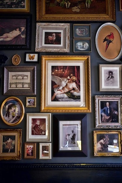
Double Mats
You aren't stuck with one mat when doing custom framing. Sometimes, using two or even three matboards can be a smart choice.
Double matting can create depth to a picture that would otherwise fall flat. Or it can add even more depth to a picture that already has this visual element to it. You can also add a splash of color.
Typically, a black or white mat gets paired with a colored mat. That way, the neutral color acts as a balance of light or dark, with the colored mat acting as an accent.
Double mats add an extra layer of complexity. Not only do you need to consider color, but also placement. The look can change completely when you flip the two colors.
Additionally, consider the amount of visual space the two colors take up. Typically, one mat will have a more narrow width than the other. But changing these proportions can also directly affect the overall impact.
Core Color
Some specialty matboards come with two colors. This is because the surface of the matboard is one color, while the inner core is another.
The surface color is the dominant color. The edge of the matboard has a bevel cut that allows you to see the core color.
These boards are good for adding a trim or hint of color. Because they are a single board, you don't have the thickness of double matting. You also don't create as much depth.
These boards are good for creating a visual break between the picture and the matboard.
Black or White
The most common matboard colors used in picture frames are black and white. These neutral colors are popular because they are easy to pair with art and won't compete or clash. These colors are also easy to pair with a room's interior design.
When choosing between black or white, consider whether you want to accentuate the shadows or highlights. To bring out the highlights, you should use a black matboard. If you want to bring out the shadows, use a white matboard.
Black
Using a black matboard will give your art a serious and sophisticated feel. When all else fails, black is the color to choose. This dark shade won't compete with the other colors and can easily pair with a wide range of frame designs.
If your artwork is black and white, a black matboard looks best when white is the dominant color in the picture. Black is also good when the picture has a lot of visual depth.
White
White is a safe choice that works in almost any framing situation. It looks clean and professional. However, there are some situations when you should avoid white.
If your art or picture has a lot of pastels, then white will only serve to wash out the image further. If your photo has a lot of off-white colors, a true-white matboard will overpower it.
Dominant Color
With this approach, you choose matboards based on the dominant color in the picture. Choose whatever color is the most present to use for the matboard. This creates a monochromatic look that brings out the other colors in the image.
You don't have to perfectly match the shade. Instead, try to get close with a similar color.
Complementary
You can use color theory to change the look of your art. With a complementary color approach, you should choose a color that is directly opposite on the color wheel to the main color in the picture.
For example, if the primary color in the picture is orange, then choose a blue matboard. This creates a visually striking display because the two colors play off each other.
If you find that the complementary color is too bright, then you can adjust the hue. For this example, bright orange and blue can be too bright and look harsh. So, instead of using a bright blue, deepen the hue to a darker shade of blue.
This tones down the visual intensity while also bringing out the beauty of the orange color.
Metallic
A metallic board will look like gold, rose gold, silver, or bronze. It isn't made of metal but has a metal-like sheen and coloring. This matboard is perfect for giving your photo or art an extra bit of glam or eye-catching pop.
Less is more with this type of matboard. You don't want it to overpower the frame or art. Instead, it should draw the eye to the art. Using it as a border in a double mat design is a good option.
Choose a Matboard Color for Your Custom Frame
Picking the right matboard color for your custom framing project can feel intimidating. However, it doesn't have to be when you do it in person. The best approach is to bring your art to a framing store and hold different mats in front of it.
You can then choose the mat color that you think looks the best. After all, your art will hang on the wall in your home. So you should love the way it looks.
Visit our shop with your art and let our experienced team help you with your custom framing project.
You must be logged in to post a comment.
click here to log in